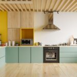
Why Kitchen Wallpaper Feels Fresh Again
Kitchen wallpaper has made a quiet but confident return, and honestly, it makes sense. For years, kitchens leaned heavily on tile, stone, white paint, and safe neutral finishes. Practical, yes. Memorable? Not always. Now, homeowners are looking for kitchens that feel warmer, more personal, and a little less showroom-perfect.
The latest Kitchen Wallpaper Trends are less about covering every wall with a busy print and more about adding character in smart, intentional places. A small breakfast nook, the wall behind open shelving, a pantry corner, or even the ceiling can suddenly change the whole mood of the room. Current design coverage also points toward bolder wall treatments and unexpected wallpaper placement as key directions for 2026 interiors, especially as people move away from overly plain spaces and toward rooms with more identity Good Housekeeping.
Warm Neutrals With Texture
Cool gray kitchens have had their moment. The softer, more livable shift now is toward warm neutrals that feel calm without looking flat. Think oatmeal, clay, sand, cream, mushroom, warm stone, and muted taupe. These shades work especially well in kitchens because they sit comfortably beside wood, brass, marble, ceramic, and painted cabinets.
The most interesting neutral wallpapers are not plain. They have texture, movement, or a hand-finished look. Grasscloth effects, linen-style patterns, plaster finishes, and soft mineral washes can make a wall feel layered without becoming loud. This is a useful trend for small kitchens too, where a dramatic print may feel too strong but a textured neutral can still add depth.
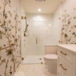
Botanical Prints That Feel Grown-Up
Botanical wallpaper is not new, but the kitchen version has become more refined. Instead of bright tropical leaves or overly sweet florals, today’s botanical prints often feel quieter and more natural. Olive branches, trailing vines, pressed herbs, faded garden flowers, and loose leafy sketches all suit the kitchen beautifully.
There is something fitting about using nature-inspired wallpaper in a room connected to food, herbs, fruit, and daily rituals. A green botanical print behind a wooden dining table can make a breakfast corner feel softer. A delicate vine pattern above a counter can bring life to a plain cabinet scheme. The best versions do not shout for attention. They settle into the room, almost like they have always belonged there.
Statement Wallpaper in Smaller Areas
One of the smartest Kitchen Wallpaper Trends is using bold designs in contained areas. This makes wallpaper feel exciting without overwhelming the kitchen. A pantry, alcove, banquette wall, coffee station, or open-shelf backdrop can handle a stronger print because the surface area is limited.
This approach is especially good for renters or anyone nervous about pattern. You can choose a dramatic floral, a moody mural, a graphic stripe, or a rich color story, but because it is not covering the whole kitchen, it still feels balanced. It also gives the eye somewhere to land. In open-plan homes, a wallpapered dining nook can subtly separate the kitchen from the living area without adding a physical divider.
Stripes and Soft Geometry
Stripes are having a graceful comeback. Not sharp, high-contrast stripes that make the wall feel busy, but softer versions with irregular lines, muted colors, and hand-drawn edges. Vertical stripes can make ceilings feel taller, while narrow tonal stripes add quiet rhythm behind cabinets or seating areas.
Soft geometry works in a similar way. Checks, grids, scallops, arches, and small repeating shapes can bring order to a kitchen without making it feel cold. These patterns pair especially well with shaker cabinets, open shelving, stone countertops, and simple hardware. They also suit both modern and traditional homes, which is probably why they continue to feel useful rather than trendy for the sake of it.
Wallpaper That Mimics Natural Materials
Stone, marble, limewash, woodgrain, and plaster-effect wallpapers are becoming more popular because they offer the feeling of natural material without the cost or weight of the real thing. This trend connects with the wider movement toward expressive kitchen materials, including richer stone, warmer wood, and more tactile finishes Wallpaper.
A marble-effect wallpaper can look beautiful in a dining corner or above lower cabinets where it will not be exposed to heavy splashing. A plaster-style wallpaper can soften a modern kitchen that feels too sleek. Wood-effect designs can add warmth to apartments or compact kitchens where real paneling might feel heavy. The trick is choosing designs with subtle variation. If the print looks too perfect, it can feel artificial.
Dark and Moody Kitchen Wallpaper
Not every kitchen needs to be bright white. Dark wallpaper is becoming a confident choice, especially in kitchens with good natural light or warm artificial lighting. Deep green, charcoal, navy, chocolate brown, burgundy, and inky floral patterns can make a kitchen feel intimate and grown-up.
Moody wallpaper works best when balanced with texture. Brass hardware, warm wood, creamy stone, woven blinds, or soft pendant lighting can keep the room from feeling too heavy. It is also worth thinking about scale. A dark wallpaper with a large, airy pattern often feels more elegant than a tiny dense print, especially in smaller kitchens.
The Wallpapered Ceiling
The ceiling is no longer being ignored. Wallpapering the ceiling can be surprisingly effective in a kitchen, particularly over a breakfast nook, island, or butler’s pantry. It draws the eye upward and adds personality without taking up wall space.
This trend is not for every kitchen, but when it works, it really works. A pale stripe can make the ceiling feel higher. A soft botanical print can create a garden-room effect. A small geometric pattern can add charm to a plain white kitchen. Because ceilings do not face the same splashes and fingerprints as walls, they can be a practical place to use a more decorative paper.
Choosing Wallpaper for Real Kitchen Life
A kitchen is not a bedroom. Steam, grease, splashes, and frequent cleaning all matter. That does not mean wallpaper is off-limits, but it does mean placement and material choice are important. Washable, scrubbable, or vinyl-coated wallpapers are usually better for busy kitchens. Peel-and-stick wallpaper can also work well for renters or for lower-commitment updates.
Wallpaper should generally be kept away from direct splash zones unless protected with glass or another wipeable surface. Behind a sink or stove, tile, stone, or slab materials still tend to be more practical. Designers are also moving toward cleaner, more integrated backsplash choices, with warmer matte surfaces replacing overly shiny or fussy finishes Livingetc. Wallpaper works best when it complements those surfaces rather than competes with them.
Matching Wallpaper With Cabinets and Counters
The easiest way to choose kitchen wallpaper is to start with what is already fixed in the room. Cabinet color, countertop material, flooring, and hardware should guide the palette. If your cabinets are green, a wallpaper with cream, olive, or muted floral tones may feel natural. If your kitchen has white cabinets and black counters, a warm patterned wallpaper can soften the contrast.
Scale matters too. Large prints can look beautiful on open walls, while smaller patterns often work better behind shelves or in compact corners. If the countertops already have strong veining, a quieter wallpaper will usually feel calmer. If the kitchen is very plain, that is when wallpaper can carry more of the personality.
Conclusion
Kitchen wallpaper is no longer just a decorative afterthought. It has become a thoughtful way to bring warmth, story, and individuality into one of the most used rooms in the home. The strongest Kitchen Wallpaper Trends are not about chasing the loudest print or copying a perfect image online. They are about choosing pattern, texture, and color in a way that makes the kitchen feel more lived-in and more like you.
A small wallpapered corner can change the mood of a morning coffee. A textured neutral can soften hard surfaces. A botanical print can make a practical kitchen feel gentler. Used carefully, wallpaper does not fight the function of the kitchen. It gives the room a little soul.